
 English
 اللغة العربية
  Bahasa Indonesia
  日本語
日本語  Bahasa Melayu
  ภาษาไทย
  Tiếng Việt
  简体中文
简体中文 Today, we want to share with you B-end product style & texture, which helps enterprises shape their brand image and provides emotional value to individual users.
Moving back through the development of the internet, from dial-up internet on desktops to 5G mobile internet, and now with the assistance of artificial intelligence, the technology field has undergone tremendous changes. In the future digital world, the experience will be required to reach higher levels in terms of immersion, engagement, and personalization. At the same time, enterprises have increasing demand for interfaces that are efficient, simple, and user-friendly. In the current situation of 2025, B-end designers need to continuously learn, adapt to new technologies and trends, strictly focus on the business value of clients, and further emphasize utility, inclusiveness, and customization in order to create outstanding products and services for enterprise clients.
Therefore, drawing from DingTalk's nearly 10 years of B-end product design experience, we analyze future B-end design trends based on the new characteristics of diversification, intelligence, and humanity. We conduct in-depth discussions on design from multiple dimensions including B-end product personalization, style, texture, interface layout, icons, and dynamic interactions. We hope that by exploring the essence and development trends of B-end design, we can provide some useful enlightenment for the path toward mastering B-end product design.
Today, we want to share B-end product styles & texture with you, helping enterprises shape their brand image and providing emotional value to individual users.
The Evolution of UI Design Style from Technological Development
Phase One: Embryonic Style
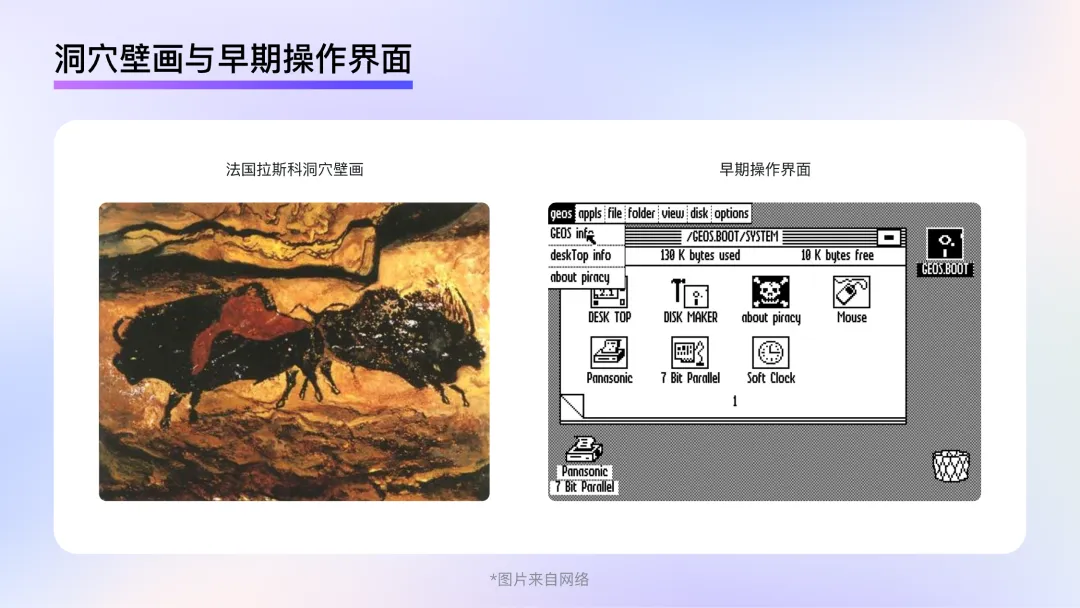
The 1970s-1980s marked the embryonic stage of computer graphical interfaces. Similar to the primitive times when painting art began and the only tool humans had was charcoal from fire, the early interfaces only had walls and rocks of caves as their canvas. In the early days of computers, designers were not only limited by the lack of professional drawing software but also constrained by computers' weak display capability. In this phase of UI design, clarity and the transmission of clear meanings on visual displays were more important than the development of a particular style. Looking at operating interfaces from the time, it's not hard to realize that the designers attempted to use specific representations to reduce people's unfamiliarity with computer interfaces. However, due to limitations in tools and platforms, the attempt could not be completely successful. Although this style couldn't officially be called a skeuomorphic style, it laid a foundation for the appearance and development of genuine skeuomorphic styles later.
Phase Two: Skeuomorphic Style
In 1995, home computers underwent a qualitative leap in display capabilities with the release of Windows95, support for true colors, and Photoshop5.0's release. Technological advances and the backing of professional software allowed designers to break through the previous restrictions on creative tools and presentation platforms, much like early humans who once used charcoal to paint in caves now having brushes, paints, and canvases available for creation. The scope and realism of design significantly increased.
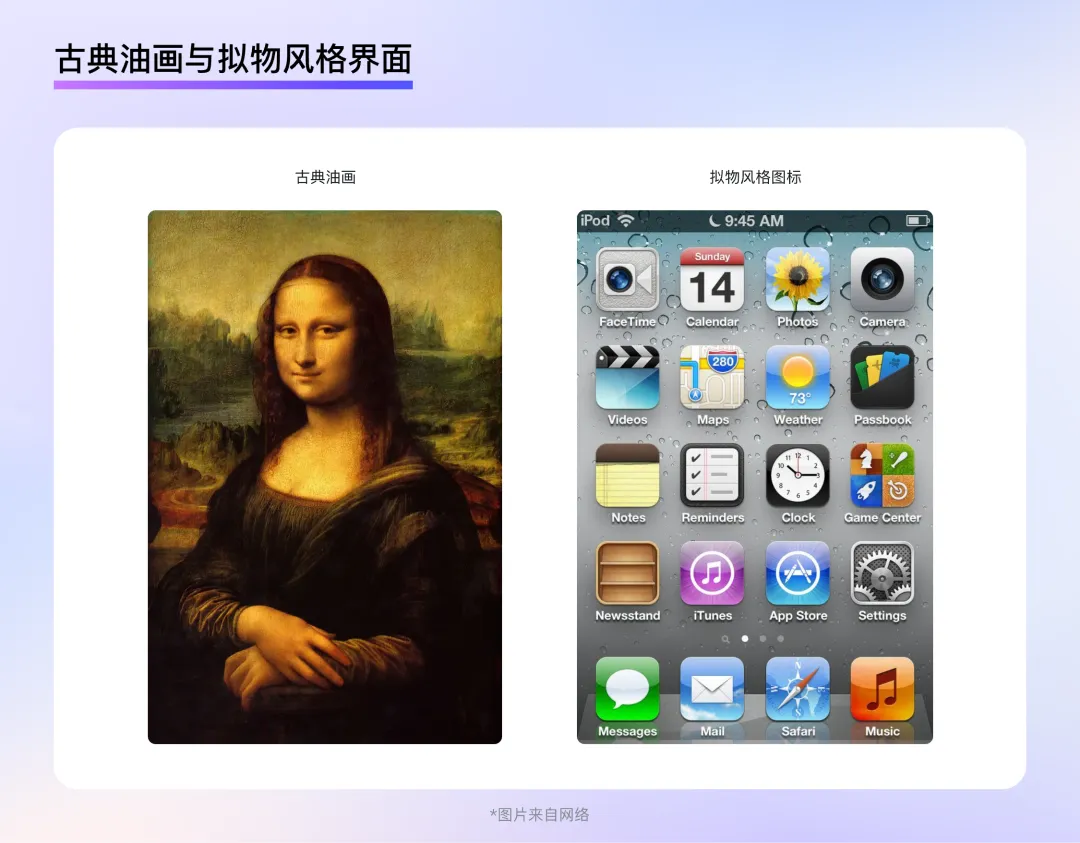
Meanwhile, personal computers and mobile phones began to become widespread. Graphical interfaces were no longer exclusive to researchers and professionals but were instead becoming part of the daily work and study life of ordinary people. To make graphical interface users unfamiliar with such interfaces quickly identify the functions represented by icons, the most effective method was to reproduce real-world objects on the interface, pushing forward the development of a skeuomorphic style.
Skeuomorphic design works simulate the appearance and texture of real-world objects by means of superimposition, highlights, textures, materials, shadows, and other effects to recreate reality, enabling users to quickly familiarize themselves with graphical interfaces and product functions with minimal learning cost and guiding user interaction in a way that matches daily habits and intuition.
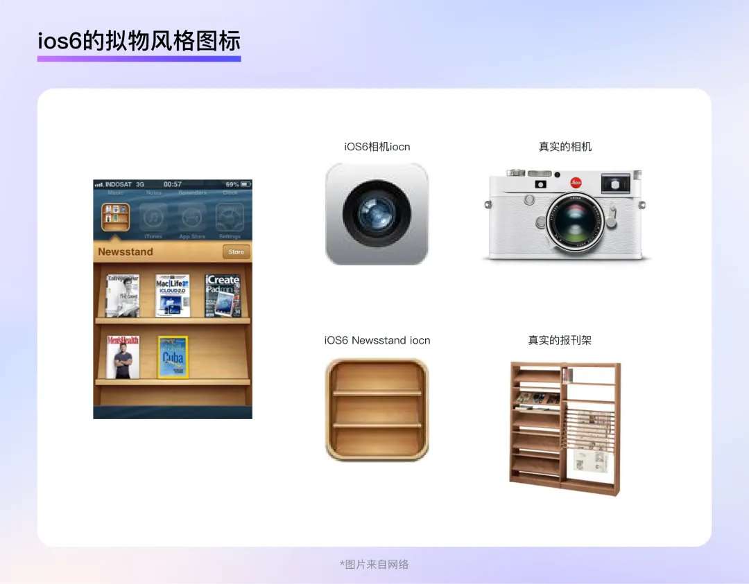
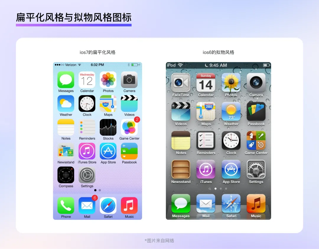
For example, the camera icon in iOS6 intricately depicted the details of the lens, making it easy for users to associate with what can be done when using a real camera, undoubtedly being of significant help for users in understanding and becoming familiar with the function of a product; similarly, the bookshelf icon in iOS6 was also exquisitely designed by highly reproducing the structure and texture of actual news racks while showcasing the magazines within the bookshelf. Users could view the contents in the bookshelf as though they were standing in front of a real bookshelf, which made the amount of information contained in such a small icon extremely rich.
Phase Three: Flat Style
By around 2013, smartphone penetration rates in major countries and regions around the world improved significantly. According to statistical data, smartphone penetration rates in many developed countries exceeded 50%, and penetration rates in developing countries were also rapidly rising. Most users were already very familiar with graphical interfaces, so they did not need extremely realistic styles to quickly understand the meanings and functionalities behind graphics. At the same time, as more information and applications flooded into smart devices, the textures, textures, and light and shadow that were promoted in the skeuomorphic style not only created exquisite effects but also led to redundant details. How to manage the explosion of information became the primary UI design issue. Similar to the 19th-century impact of photographic technology on traditional realistic painting art, which led artists to rethink the future direction of painting, the extreme physical realism of skeuomorphic design had also reached a turning point after reaching its peak.
In September 2013, iOS7 was released, and it was the first mobile operating system to adopt a flat design style in UI design. This style discarded the realistic lighting, texture, and redundant details from the skeuomorphic design style. It even abandoned the shaping of volume and any elements that might interfere with recognition, only retaining the most critical information for the user, thus presenting a very clean visual effect.
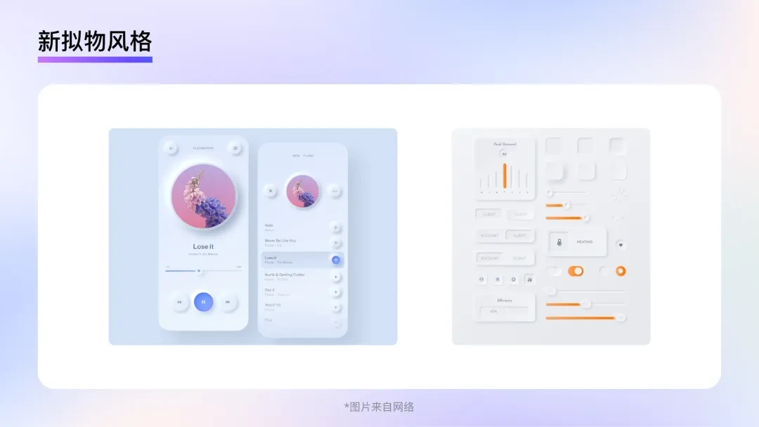
However, moderation is necessary, as excessive simplicity in flat design might make users feel cold and boring over time, so the Neo-Skeumorphism style came into being naturally.
Neo-Skeumorphism integrates features of both skeuomorphic and flat styles. It uses a more realistic approach for lighting and 3D effects, usually having elements that protrude or recess from the interface surface, creating an uneven visual pattern. However, in terms of color and shape, it leans more towards flat styles, with graphics simplified and abstracted, often paired with a few simple, distinct colors. However, Neo-Skeumorphism overly relied on the differentiation of interface elements through shadow and 3D effects, making it difficult to represent complex hierarchical information. The subtle contrast also made accessibility recognition challenging, so this style did not truly gain widespread popularity and usage.
B-end Design Style Trends in the AI Age
In 2022, ChatGPT was released, achieving an unprecedented level of natural language processing by AI. At the same time, the breakout of Midjourney and Stable Diffusion demonstrated the allure of AI-generated art to everyone. Consequently, not only did various AI applications and websites emerge rapidly but also upgraded their AI capabilities one after another across different industries. In this historical context, UI design was presented with a new mission: How can design demonstrate an app's AI capabilities and the industry's intelligent mind.
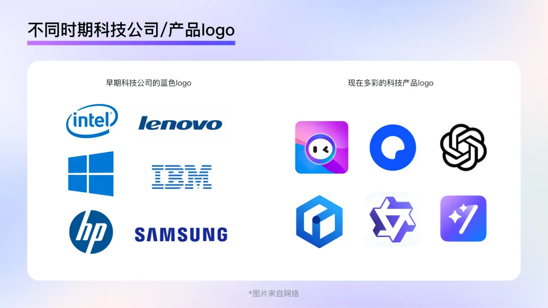
Trend 1: Multicolored Colors
Colors play an essential role in B-end design styles, providing users with strong visual experiences, forming the first impression they have of a product or brand. For instance, blue used to be associated with B-to-B or tech products, as seen in companies like Intel, Microsoft, Lenovo, Dell, and IBM, which use blue to convey a sense of simplicity, futurism, and high technology. However, this standard is not static, and an increasing number of B-end designs opt for vibrant colors to showcase the dynamic characteristics of intelligence, indicating that the expression of technology is not monotonous but rather more versatile.
Diffusion Gradients
Diffusion gradients are a unique type of gradient that mixes multiple colors through a blur effect. The merging of various colors and irregular gradient patterns gives diffusion gradients a potent atmosphere setting effect and expressiveness. Diffusing colors resemble a subtle and dreamy spread in the void, which is ideal for enhancing the atmosphere in a specific area of the interface.
Excellence Scene Applicability
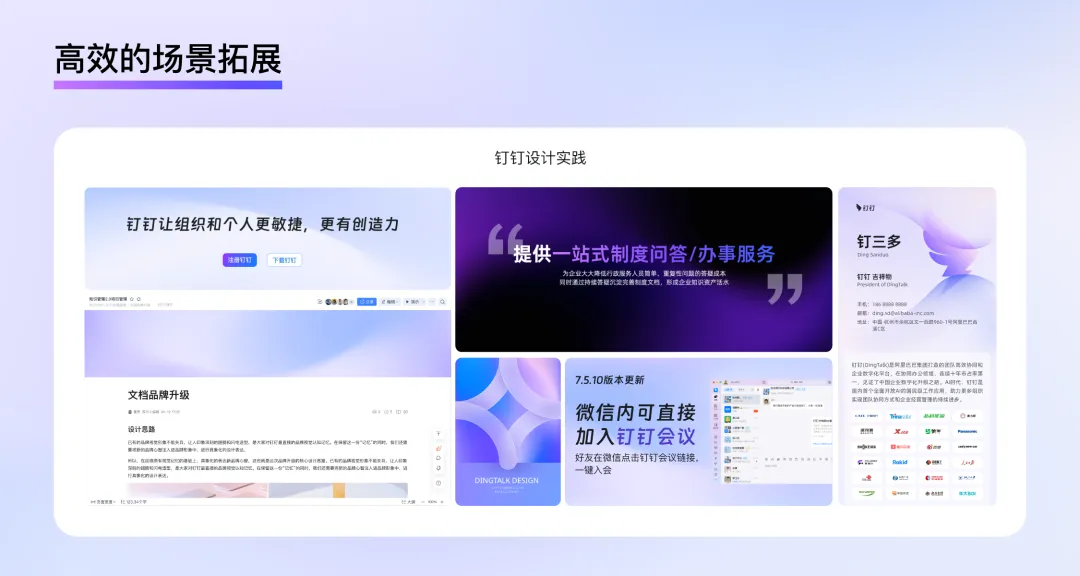
In B-end design, screen efficiency and recognition are particularly important. Using graphics or illustrations to set the tone often takes up more space and may lead to problems with overlapping text and images during the adaptation process on the web page. However, due to the features of diffusion gradients being blurry and uniformly bright, they can contribute to image richness without creating visual focal points, and thus avoid the problem of overlapping text and images during adaptation, resulting in a wide range of application scenarios.
Efficient Scene Expansion
During gradient adjustments, diffusion gradients can present a visually layered effect by maintaining some relatively crisp outlines, similar to some real objects floating behind a frosted glass panel, giving the scene a sense of space. This form of color variation can take specific shapes like a wave pattern, sphere, or hill, among others. Paired with simple typography, these backgrounds can be posters, banners, or push covers, providing a highly efficient solution for the rapid iteration of B-end design.
Dynamic Change
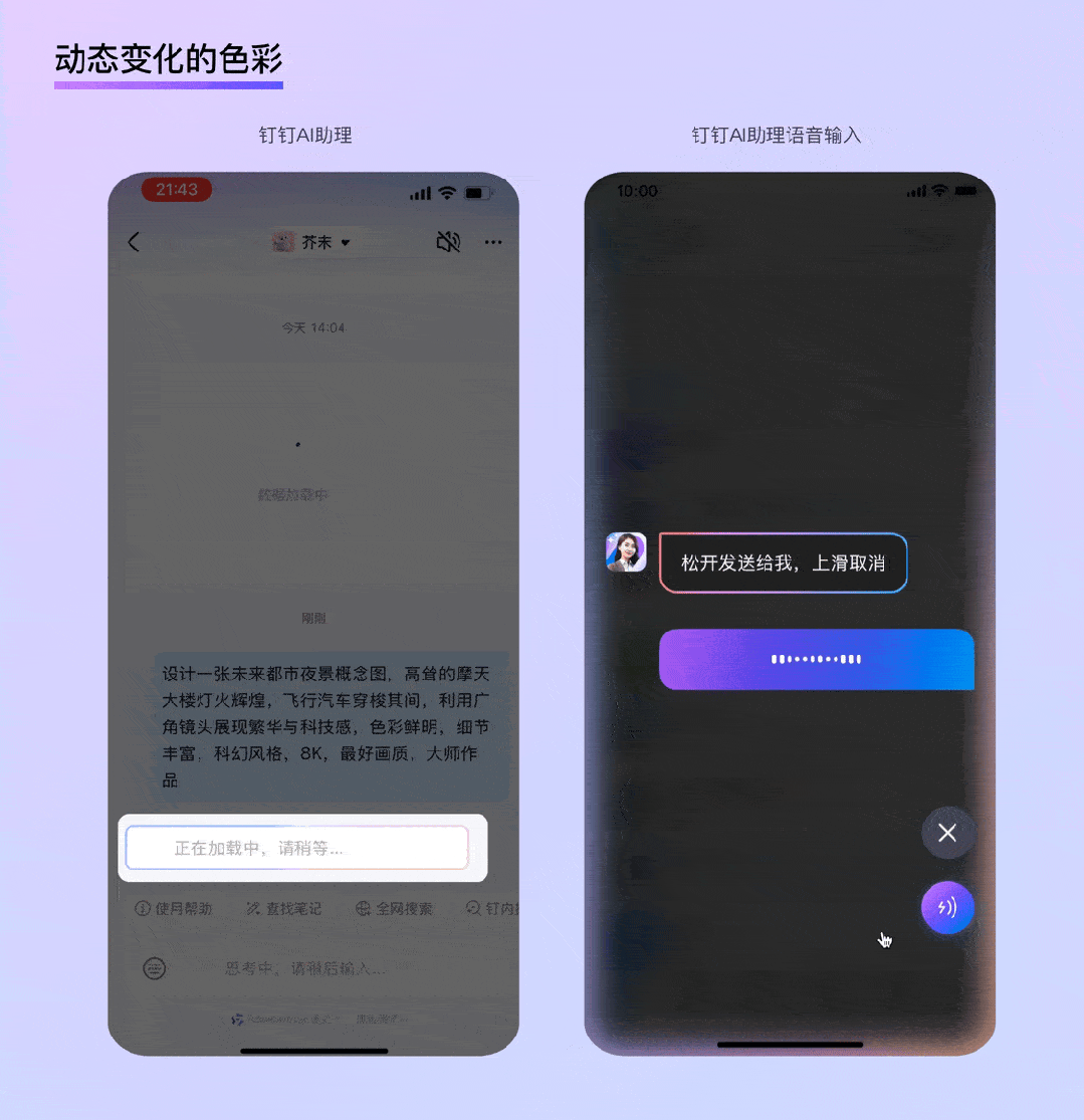
According to data, the generative time for AI images in mobile apps is generally between 10 seconds to 120 seconds. The average time for AI search is roughly between 2 seconds to 15 seconds, while professional writing AI takes about 3 seconds to 30 seconds to complete a piece of writing...
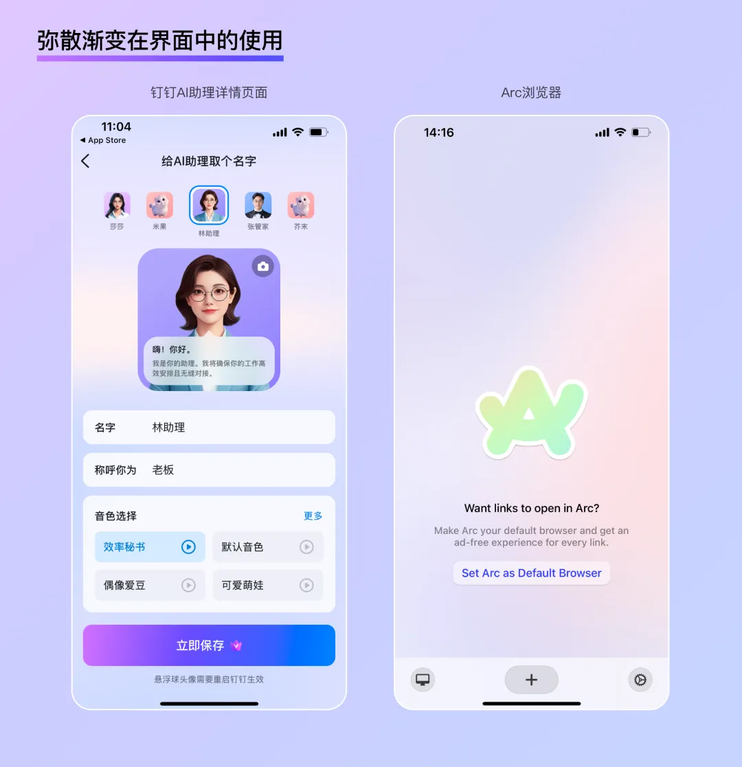
AI applications are often accompanied by significant waiting times. Using dynamically changing colors can reduce the anxiety felt by users during this waiting period. The constantly shifting, flowing colors also indicate that the process is still ongoing. For instance, during the wait for the DingTalk AI assistant's response, the chat bubbles display a colorful light effect. When a user is engaging in voice interaction with the AI assistant, the entire screen's edge presents a dynamic colorful light show, indicating the current AI-activated state.
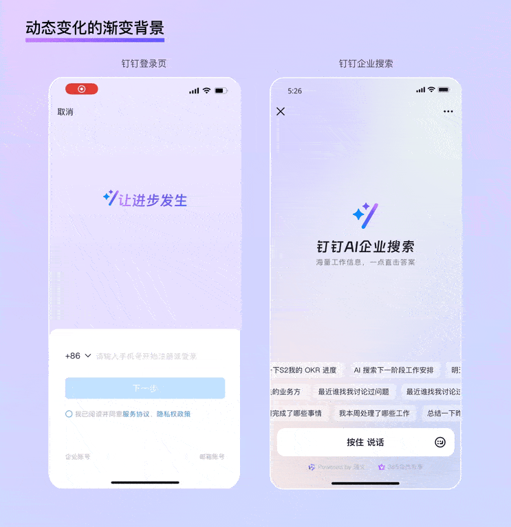
Apart from that, full-screen dynamic gradient backgrounds are also suitable for landing or homepage interfaces with less information. For instance, nearly two-thirds of the space on the DingTalk login page is occupied by a simple text animation paired with a full-aura dynamic gradient, clearly conveying the brand's intelligent concept while adding a sense of ceremony to the "login" operation. Similar examples include the homepage for the DingTalk AI search function, where the vast dynamic gradient highlights the intelligent mindset visually, while the large areas of whitespace make the description of the enterprise search value more prominent.
Trend 2: Delicate and Restrained Texture
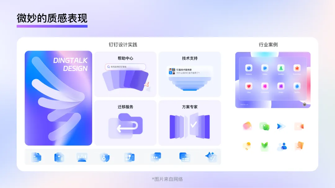
Although the neumorphism style has not been widely used or popularized, its birth and popularity reflect that the essence of design is actually a competition between function and aesthetics. This is even more so for B-end design; on one hand, users desire elegant design to please them during work, but they do not want their work efficiency to be hindered by flashy colors and decorations; on the other hand, enterprises want to get rid of the impression of being dull and old-fashioned, but also need to present a professional and technological image to maintain credibility. Expressing delicate and restrained texture provides a solution to achieve this 'balance'.
Glass Imitation
Glass imitation has been a popular design style since late 2020. As the name implies, it is a type of skeuomorphic design for glass material. Compared to the new skeuomorphic style, the most obvious improvement in the glass imitation style is that it cleverly utilizes the glass material to solve issues related to unclear element boundaries and difficulties in showing complex hierarchies in the new skeuomorphic style. Its style characteristics can be summarized as follows:
Transparent:
Due to the transparency of frosted glass, when there are multiple levels in the interface, it can display a combination of virtual and real beauty. Moreover, its transparent property can well imply the user's current position. Utilizing this characteristic not only makes it easier to present the information that the user is currently focusing on but also significantly reduces the psychological burden of users during operation through the interaction logic of "superimposition" instead of "jumping."
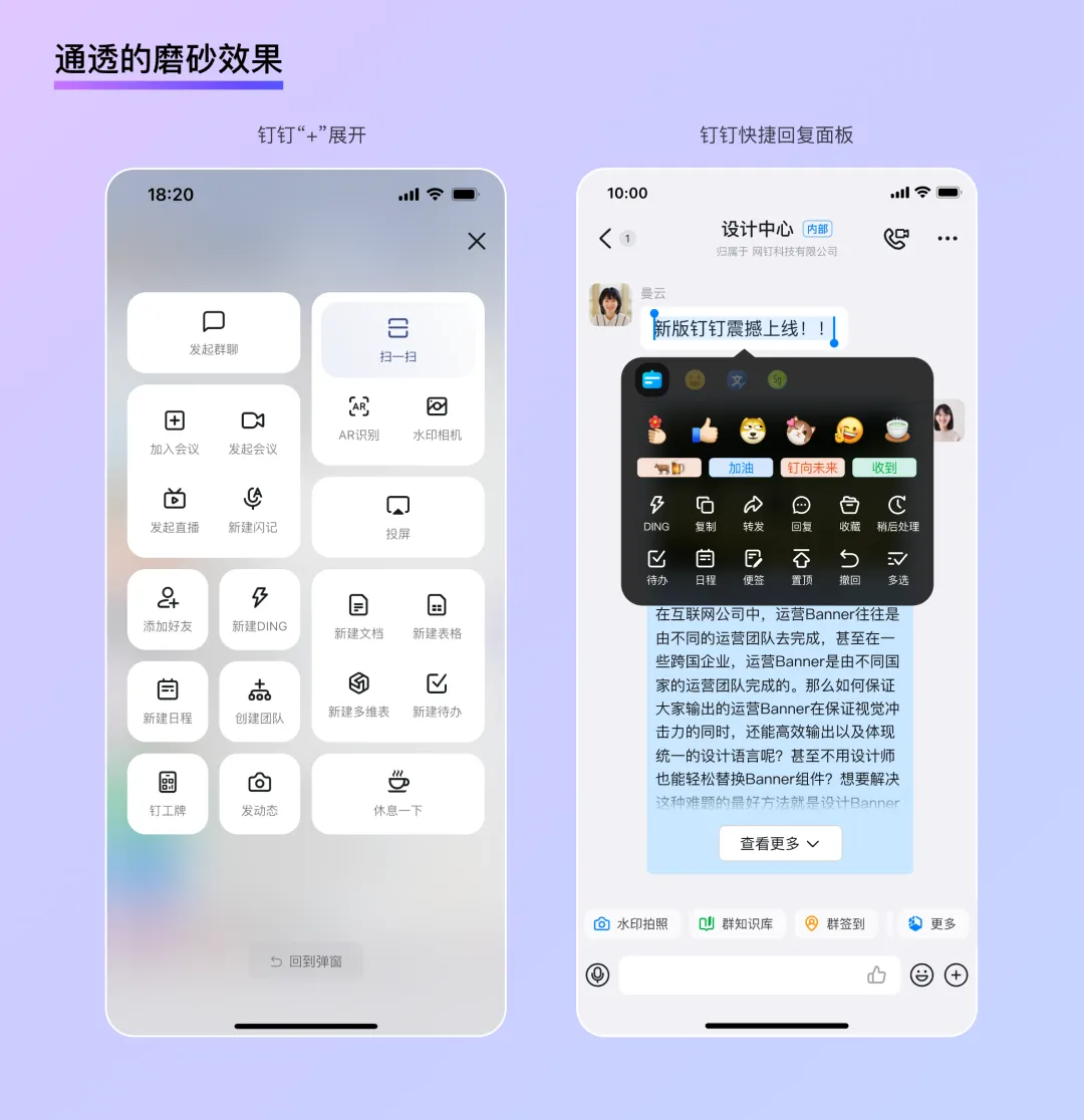
Suspended:
Traditional skeuomorphic styles often create a ground surface, with icons "placed" on it. On the contrary, the glass imitation style is like constructing a "gravity-free" virtual space. The elements in the interface have a noticeable floating feeling, appearing very light, and are also particularly suitable for the presentation of technology in B-end scenarios. Coupled with projections and contrast between virtual and real, users can clearly feel the height difference of elements in the space, not only ensuring the readability of information but also making interactive elements more clickable.
Subtle:
Because of the physical properties of frosted glass, the page background after blur processing of the "glass layer" becomes very soft. Similar to the "diffusion gradient" mentioned above, it presents a state with uniform brightness and no visual focus, whether it's dynamic or static, ensuring the recognizability of elements such as foreground text and UI control components. Moreover, in the glass imitation style, thin and subtle frames are often used to enhance the physical texture. This method, acting both as an outline and showing the thickness of "glass," allows cards to appear on the interface with an appropriate contrast.
In summary, the glass imitation style finds a good balance in the degree of physical representation. It provides a realistic and interesting aspect for the traditionally dull B-end designs while also ensuring the recognizability of complex information. Moreover, the physical properties of glass, such as smoothness and transparency, provide a new direction for presenting "technical aesthetics" visually.
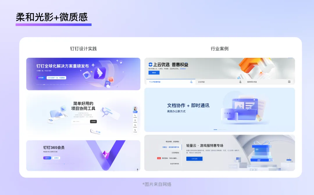
Soft Lighting + Subtle Texture Materials
Unlike the strong lighting effects commonly used in C-end design to attract users, B-end design is relatively more stable. When comparing the official homepage of Alibaba Cloud, WPS, DingTalk, Tencent Cloud, they all consistently use very soft ambient lighting. This lighting design maintains the overall brightness without creating clear lighting direction and shadow effects. Additionally, in terms of material selection, diffuse reflection materials or micro-textured frosted glass materials with no obvious highlights or reflections are chosen, giving an overall visual experience that is calm and clean.
Trend 3: Clear and Understandable Graphics
Graphics play two parts in design: on one aspect, they serve as decoration of the page and need to guarantee aesthetic pleasure. On the other side, they also act as the supplement of text information, which needs to convey certain specific meanings. A good graphic design not only can add luster to the overall page atmosphere, but also can help users better understand the text information.
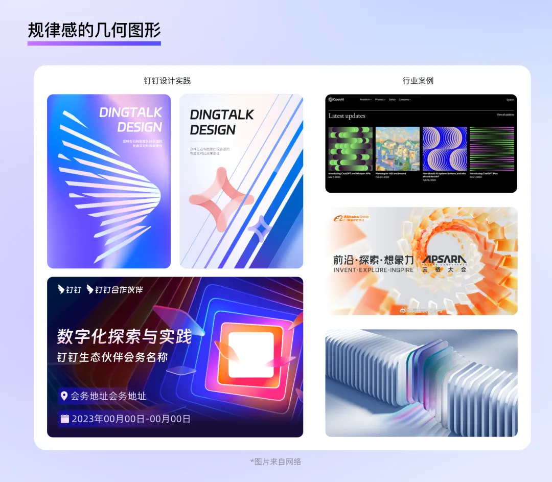
Structured Geometric Figures
In B-end circumstances, people often need to use graphics to express some abstract thoughts, for instance, PaaS, servers, AI, utilization, technique, traffic... These meanings do not directly match a specific shape, using structured geometric figures appears like a decent alternative. These technical ideas come from the pairing of 0 and 1 in binary underneath. Arranging the geometric elements organically and even developing different forms during this process isn’t this very much like composing code?
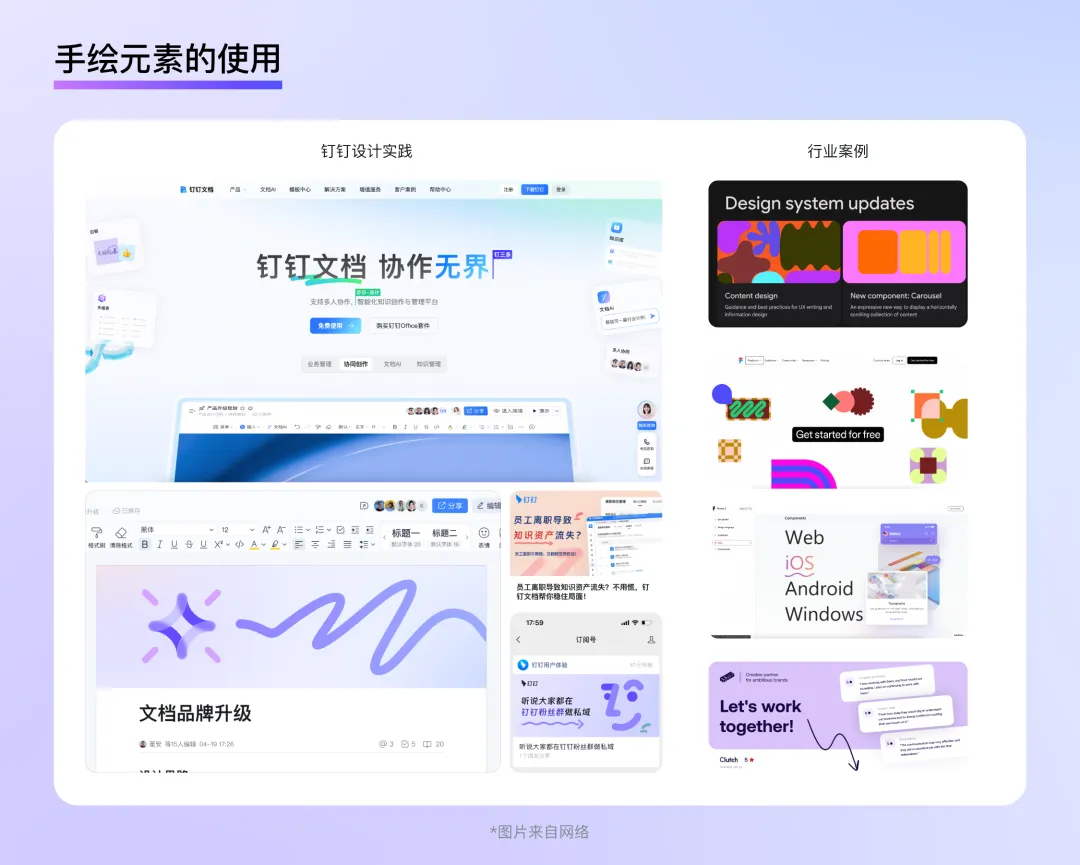
Simple and Efficient Hand-drawn Elements
In today's B-end design area, more and more emphasis is placed on emotional care and the user's experience. Using hand-drawn-like elements on the page or directly choosing hand-drawn pictures as illustrations can quickly bridge the brand and users, shaping a youthful and approachable brand image. This not only improves users' pleasure during product use but also makes the figures full of a relaxed feeling more concise than traditional illustrations or 3D models, with vivid colors and strong expression capabilities. Additionally, it costs less design time, making it very suitable as an illustration for small and beautiful products.
For example, Google's Material Design language uses abstract and vivid hand-drawn elements as illustrations. These patterns emphasized colors without overly detailed modeling. They interweave within the text, bringing vibrancy to a dark background page. Similar to this is the official website of Figma, where designers abstracted certain tools from the software, such as lines, wireframes, anchor points, and pointers, as illustrations. This not only makes the design concise and durable but also gives a distinct brand characteristic. In addition, using hand-drawn lines to represent interaction states, circling important text information, or performing operation guidance is also highly efficient. A simple arrow or wavy line can directly draw the user's attention to the key information, much like a student circling important parts in a textbook—very natural and intimate. It felt like the designer of the app whispered a little tip into the user's ear, instead of just throwing the information at them.
Conclusion
Whether it's the extreme realism of the skeuomorphism era, the minimalist phase of the flat design era, or the vibrant colorfulness of the AI age, the development of design styles has always evolved around the main technological progress, with the ultimate goal being to make the users of the current era better and more conveniently enjoy the convenience brought by technology. A good B-end design style can not only help companies showcase their brand mind and technological advancement but also enable individual users to perform tasks more efficiently and pleasurably. In the future of B-end product design, we should always adhere to the principle that form serves function and is human-centered, exploring design styles more suited to business scenarios and providing users with a more comfortable and natural visual experience.
These are the design trends for B-end style mentioned in this session. In the future, we will further explore the essence and development of B-end design from the perspective of layout.
Dom Tech (DomTech) is the designated service provider for DingTalk in Hong Kong, dedicated to providing DingTalk services to a wide range of customers. If you want to know more about the content of DingTalk platform applications, please feel free to consult our online customer service. We have an excellent development and operations team and abundant market service experience, which can provide you with professional DingTalk solutions and services!